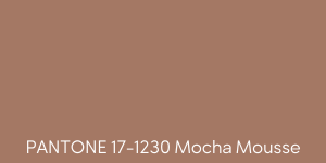
Earlier this month, the Pantone Color Institute announced PANTONE 17-1230 Mocha Mousse as the 2025 Color of the Year. This warm, rich brown hue is described as "a versatile shade infused with inherent sophistication and earthy refinement." Let's look at how to integrate this earthy tone into your digital signage content while ensuring accessibility and optimal contrast for all audiences.
Consider your environment
The warmth and richness of Mocha Mousse can be valuable in spaces like retail, hospitality, and healthcare when trying to establish trust and or foster a sense of comfort. For retailers, it is a great background color option for advertising seasonal promotions or highlighting products in a way that creates a sense of richness and luxury. Restaurants and cafés could pair it with images of their foods and beverages to create a feeling of indulgence and quality.
Incorporating Mocha Mousse can help create a sense of calmness in healthcare or wellness spaces. The warm brown is less harsh than stark blacks or greys and may work well on digital signage in these environments where patients or visitors often feel anxious. Whether used as a primary or accent color, it will help create a sense of grounding.
Harmonizing Color Palettes
Mocha Mousse pairs beautifully with a variety of colors, opening up many creative possibilities for digital signage design. Consider complimenting Mocha Mousse with muted greens, soft blues, or golden yellows to enhance its natural warmth and create balanced and visually appealing designs. If you want vibrancy, pair it with bold colors like terracotta orange or teal blue. These combinations can bring energy and focus to digital signage without overwhelming viewers. When adding text overlays or graphic elements to this color on your digital signage, cream or off-white can provide a subtle contrast, ensuring readability while maintaining a cohesive aesthetic.
Accessibility and Contrast Considerations
There are a few accessibility design challenges when using Mocha Mousse. Ensure you have a sufficient contrast between Mocha Mousse and the other elements of your digital signage. With contrast, the warmth and mid-tone share of Mocha Mousse will make screens easier to read. A higher contrast ratio means better legibility. We suggest the contrast between the text and background on digital signage is greater than or equal to 4.5:1 for small text and 3:1 for large text.
When using Mocha Mousse as a background color, pair it with text in lighter or brighter shades like white, cream, or pastel hues to maintain a strong contrast ratio. Pure white is excellent for bold, impactful text, offering readability and visual sharpness. Avoid using similarly warm or dark tones, such as deep reds or browns, for text or graphic elements, as these combinations can reduce visibility and strain the viewer's eyes.

When Mocha Mousse is used as an accent color—such as buttons, icons, or borders—it's important to ensure these elements stand out against their surroundings. Cooler tones like light blue or gray are an option for creating a striking but accessible contrast when combined with Mocha Mousse. Additionally, incorporating shadows, outlines, or textured gradients can further enhance the visibility of these design elements on digital screens.
Dynamic Applications
The warmth and depth of Mocha Mousse make it a great color to consider for dynamic and interactive digital signage. Consider experimenting with layering Mocha Mousse in transparency effects, creating depth and dimension in digital layouts.
Whether using Pantone's Mocha Mousse or another vibrant color palette, prioritize proper contrast and legibility on your digital signage screens. Thoughtful design ensures accessibility, enhances viewer engagement, and creates visually impactful content that resonates with diverse audiences in any setting.
