It's that time of year again when we say goodbye to the current year and look forward to the year ahead and all the exciting opportunities it provides. Each year brings new and fresh ideas and trends into the design world. But how can these be applied to digital signage? Let's look at what we're seeing in digital signage design and what we can expect in 2023.
Dark Mode
Dark mode has become popular on mobile phones, websites, and apps, but will it work for digital signage? First, let's understand what it means. Traditionally content is displayed as dark text on a light background. Dark mode flips this around. It is a display setting where the screen is black or dark, and the text is white or grey. This reduces the light emitted by the screen, which could reduce energy consumption and improve its life span. However, newer energy-efficient LED and LCD screens provide the same energy-saving benefits without using dark mode.
It is also believed dark mode minimizes blue light exposure and eye strain. However, other experts believe that light text on a dark background increases eye fatigue, can be challenging to read in specific lighting conditions and appear washed out. Regardless of the difference in opinions, dark mode is worth investigating and evaluating if it makes sense for your particular digital signage applications.
What we're seeing in digital signage is the trend to bring the analog world into the digital signage realm. While some applications mimic the outside world, such as digital wall art that changes based on the current weather conditions, we're seeing more requests to trigger dark mode versions of designs based on the time of day or triggered by environmental lighting. For example, screens changing from a light background during the day to a dark background at night.
3D Graphics and Motion
Metaverse or not, 3D graphics continue to be popular. This is because they provide depth to visuals that can't be achieved with flat graphics. In addition, with 3D graphics, you can make something literally jump off your screen, which is crucial in an era where creating an experience for the viewer is a top priority.
Motion also continues to be a significant design trend. More and more content is being viewed on digital platforms, from phones to tablets to digital signage. Static images can't compete in a world filled with Tik Tok videos, Instagram reels, and YouTube. Motion draws people's eyes to your screen and content, and even subtle movement can have a significant impact.
What we're seeing more and more is the addition of motion graphics to digital signage applications. There's little doubt about animation's ability to attract the eye, and in a world of ever-increasing digital signs, grabbing the audience's attention is essential, and motion graphics helps.
Be BOLD
Whether it is graphics, colors, or font, boldness is trending. One of the aims of digital signage is to grab the viewers' attention. Bold colors stand out in a crowded visual world. They provide brands with a way to set themselves apart and create a recognizable look that draws their eyes. Consider vibrant and highly saturated colors when designing your digital signage content. In addition to grabbing attention, they also convey a sense of excitement and energy. Just ensure the colors you choose don't distract from the message you are trying to convey.
Pantone's Color of The Year for 2023, Viva Magenta, is an excellent example of the bold trend. They describe it as "brave and fearless, and a pulsating color whose exuberance promotes a joyous and optimistic celebration."
Geometric shapes are another way to be bold. Use them to highlight essential information in your screen layouts, create patterns, or as part of your background. Rounded geometric shapes can create a sense of movement in your designs. Geometric shapes combined with vibrant colors will ensure your content stands out.
Data, Data, and More Data
Data is the largest untapped resource within any organization. Leveraging data to create a personalized and engaging experience for your audience is a growing trend. Whether it is data from IoT devices and sensors, scheduling systems, news and weather feeds, or internal systems, data can enhance your digital signage experience. Digital screens with real-time data like news, weather, traffic, wait times, and KPIs, puts information at your audience's fingertips. It alleviates stress and enables them to make smart decisions.
Popular data sources to integrate into your digital signage include:
- News and weather feeds - Customize your news and weather content to reflect the geographic location and type of information you want to share on your digital screens.
- YouTube - Leverage videos on your organization's YouTube channel as a content source for digital signage. Videos are significantly more engaging than static content for your audience and attract attention and interest.
- Social media - Sharing social media content on your digital signage provides trust and transparency, increases interaction, improves employee engagement, and increases followers.
- Financial/stock market feeds - Integrate stock updates from NASDAQ, NYSE, TSX, and other exchanges worldwide into your digital signage layouts. Highlight individual stocks, the top 100, top movers, and more.
- Traffic - Sharing real-time traffic information helps alleviate stress and enables employees and visitors to optimize their commute.
- Internal systems - Leverage information from your internal software systems such as CRM, ERP, POS, Inventory, and more to incorporate into your digital signage.
- Calendars and schedules - Integrate Google and Office365 calendars into your digital signage. Show the availability of both individuals and resources, such as meeting rooms.
- IoT devices - Using IoT devices, including cameras, sensors, RFID tags, and more, you can provide contextual messaging that improves visitors' experience in public venues such as airports, sports arenas, and conference spaces.
- Emergency notification systems - Combining existing audio alarms and critical event management solutions such as Everbridge with digital signage is an excellent way for organizations to improve disaster preparedness and safety plans.
How is data a digital signage design trend? Digital signs are more than just digitizations of printed signs. With the right software platform, data can alter and change the design.
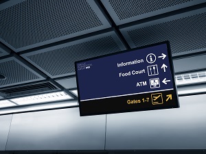
For example, say you're designing screens for an airport, and there's a display showcasing departing flights. Suppose the number of flights only fills part of the screen at certain times of the day. In that case, you can incorporate another use into your design, whether you want to display ads, airport messaging, visual paging - whatever you or your client wants to communicate. That's data influencing your design.
Though it means more work at the design stage, it also involves more communication with the client and a greater understanding of what they want to accomplish, which is always good.
Accessible Design
Why is it there if part of your design isn't clear or visible to your audience? It is important to consider how it may look to someone with a disability and how you can make your design more accessible. There are three key areas to consider when creating an accessible design - color, font, and interactivity.
Color
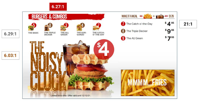
Part of designing with color is using color correctly so that the key message is clearly legible to everyone. Setting proper contrast between elements in your design helps. Contrast is the difference in perceived brightness (or ""luminance" ”) between two colors. When dealing with multiple objects, such as letters on a background, it is expressed as a ratio and ranges from 1:1 to 21:1. Focus on your contrast ratio - make sure your design meets a 4.5:1 ratio.
Think of everyone when creating designs for your digital signage - avoid color combinations such as green and red, and green and brown. There are different types of color blindness, and it is important to consider how your color combinations may be seen by someone with color blindness. Check your design against a color blindness simulator to see if parts are murky or hard to distinguish from one another.

Font
There's only one rule when selecting a typeface to use - know your audience. If you have a brand guide, someone has determined the font you should use, and they've done that by researching your brand's audience and messaging and selecting the font that best aligns with your audience. So stick with your style guide's font.
Where do you start if you can select a font to use on your digital signage or are trying to determine what font to use? The ADA does not offer a list of compliant fonts but provides guidelines. Fonts used on digital signage should be sans-serif, with limited styles - no italics or obliques. Script and decorative typefaces are also not recommended.
Decorative fonts can be fun and great to use in ads for events or products - again, know your audience. However, suppose you are creating a digital sign that communicates information to the public, such as directions, wayfinding, regulations, etc. In that case, it's best to choose a font that meets accessibility requirements.
Interactivity
Before you start designing your interactive digital signage solution, it's a good idea to find out how it will be used. What kind of display? Will it have a portrait or landscape orientation? What type of enclosure will it be encased in?
For wheelchair accessibility, sloped kiosks, usually between 15 degrees and 20 degrees, are generally recommended. Sloped kiosks at this angle are usually easier to use. When a person is seated in a wheelchair, the maximum height for a safe forward reach is 48 inches. If using a standing vertical kiosk without any slope, ensure your design doesn't require the user to reach higher than 48 inches or lower than 15 inches.
Consider adding an accessible option button that is placed in the accessible portion of the screen. When the button is activated, the screen design, menus, and buttons adjust to meet the requirements of a user in a wheelchair or with accessibility issues. Additionally, you can offer high-contrast options or change the font size on your screens.
That's what we predict we'll see more of in 2023. Digital signage is continuing to grow and expand, and it is a fascinating medium to design in. Every year, we see exciting new projects that push the medium forward, and we're looking forward to what 2023 will bring.
