Overview
In the interest of improving the Ink user experience, we are giving the Ink App Designer a bit of a facelift.
- A new component bar is always present for easier access
- Updated component icons
- Other panels are collapsible and grouped together on the right side of the designer
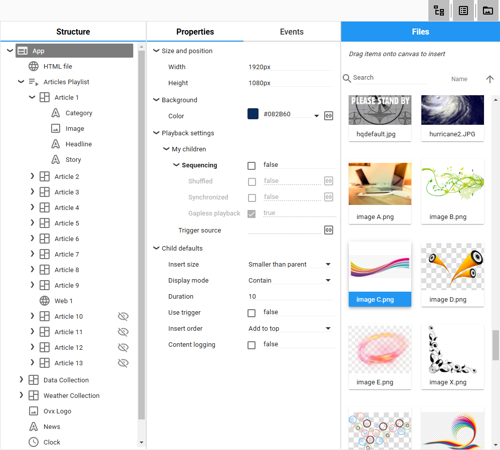
- Larger file insert panel to make finding files easier
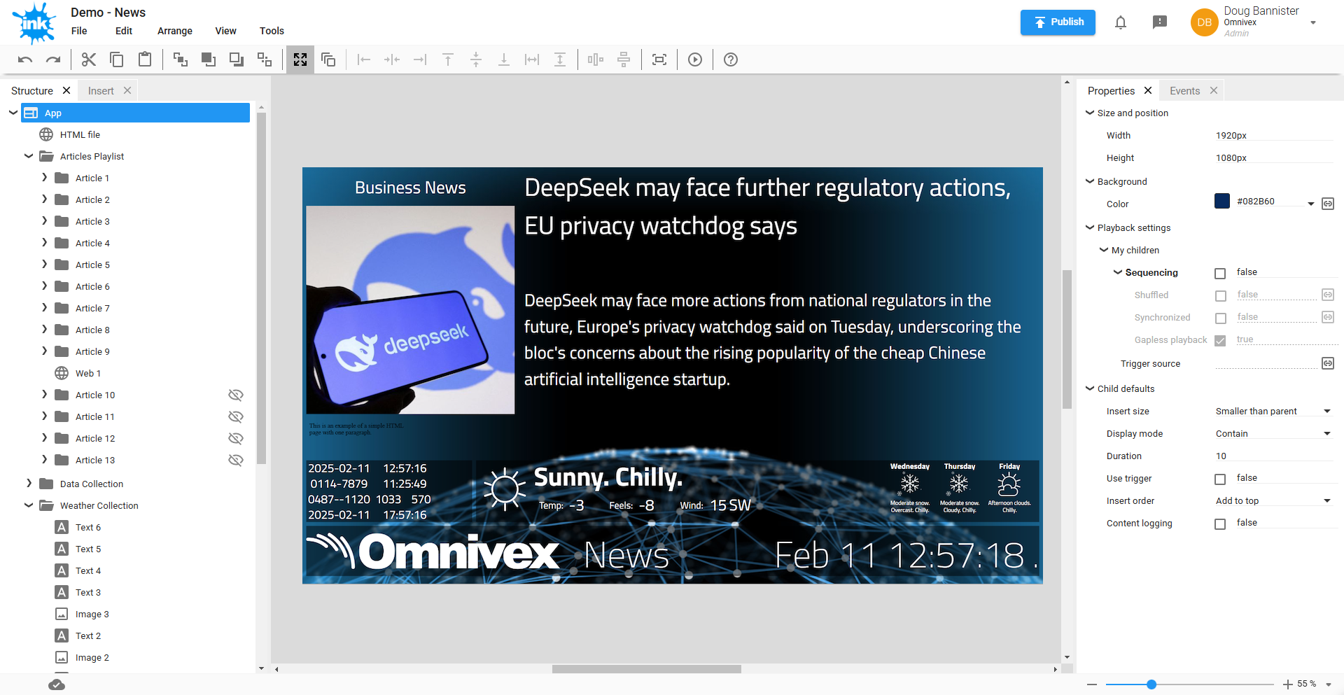
Current Designer
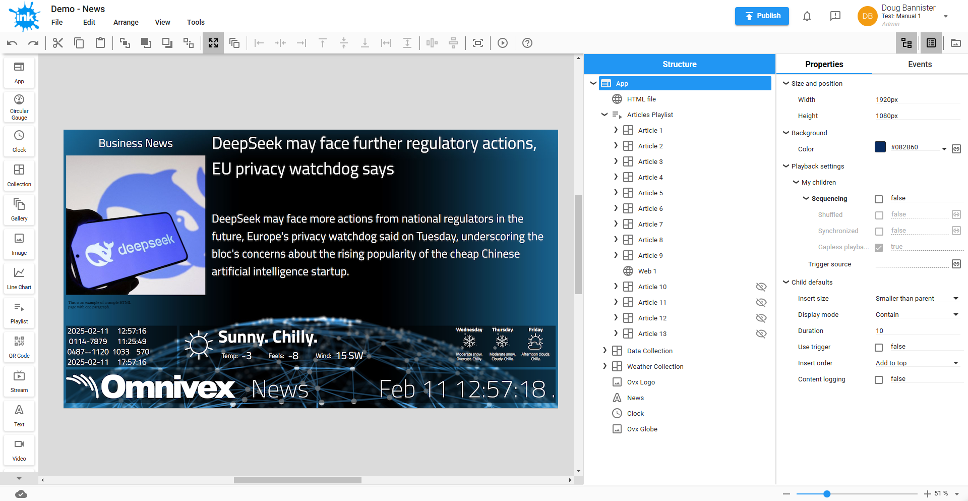
New Designer
Component bar and new icons
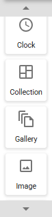
This bar is always present on the left side of the screen to provide quick and easy access to all the various components that can be dropped onto the design canvas to build your app.
It is extensible and will grow as we continue to add support for new types of components. It also scrolls so that all components are accessible, regardless of your screen size.
To add a component to the design canvas, simply drag a component from the bar and drop it where you want it.
We have created some new icons for some components to improve clarity and ensure they all appear consistent with each other and the rest of Ink.
Collapsible panels
The panels have been grouped together to reduce the amount of mouse movement from one side of the designer to the other. They still have the same capabilities and hold the same controls as before.
The panels of functions can now quickly and easily be shown and hidden as needed with a single mouse click. On the right side of the toolbar above the panels are buttons to control each one. Click to show or hide.
- Structure – this contains the hierarchical structure tree of the app and the layers of components.
- Properties and Events – this contains the controls for setting appearance and actions of the app.
- Files – this is a quick view into all the files in Ink. These can be dragged from here to the designer.