Creating a digital design can be simple, but it does require some thought and preparation. Research is a crucial part of ensuring what you create meets the needs of your audience. Design is an iterative process, so don't be afraid to sketch, get feedback, and test ideas. Lastly, don't forget the details, as they can make or break your design. Let's look at each of these areas in more detail.
Research
A big part of any design project is research. Try to answer the questions - who, what, where, when, and why. When considering "what," dig deeper and think about what to include in the design and what to avoid (i.e., fonts, colors, specific visuals). Often people have a clearer picture of what they don't want to see versus what they would like to see. Consider the overall look and feel of the digital signage and review what elements are typically included in similar screen layouts. Determine if there are industry-specific requirements.
Additionally, research the software you plan to use to drive your digital signage. Find out if there are any limitations, such as video and graphics capabilities, file sizes, and types. Also, consider the software's abilities, such as connecting to real-time data, playlists, and metadata.
Sketch
Don't be afraid to put ideas on paper. Grab a sketchbook or your computer and let your creativity flow. The ideas matter; don't get caught up in whether something is good or bad. Sketches are just a way of conveying your thoughts and flushing them out. Don't be afraid to share them and ask for feedback. There will be a lot of changes between your initial sketch and the final visual.
Here are a few technical things to consider as you are sketching:
- Use a one-to-one aspect ratio in your designs, so if you are designing for a standard HD screen, your composition should be 1920 by 1080, and your sketches should match that aspect ratio. Put a frame on your paper or screen to match the aspect ratio of your screen.
- Knowing the type of screen you are designing for, and any specific requirements are essential.
- Identify what to include - time, weather, date, logo, social or news feeds, KPIs, real-time data, design elements, etc.
As you sketch, consider these principles - Contrast, Balance, White Space, Scale, Hierarchy, Movement, Repetition, Variety, and Unity.
Contrast - Contrast is more than just contrast in colors and tone. Apply contrast to every part of your design, including typography, element size, and size of areas/blocks in your composition. Applying variation in your design goes a long way to creating a more appealing and professional-looking design. In addition, contrast in colors is essential if your audience members are visually impaired.
Balance - Balance is the distribution of elements across your design. It helps make your message clear and visually prioritizes information. A layout that isn't properly balanced makes it difficult for the viewer to know where to look or what information is important. They will also likely miss key details you were trying to share. A balanced design is more visually appealing.
White space - White space is often not thought of in digital signage, and it isn't necessarily white! It is the negative space that surrounds elements of your design. There is a tendency to want to fill every pixel with something. However, white space is positive in your designs – it lets things breathe and be their own. The use of white space can help lead the viewer's eyes to what you want them to see on the screen and emphasize key elements. Of course, there are always exceptions, such as FIDS screens in airports, where showing as much flight information as possible on the screen is essential.
Scale - Where should people look? Applying variety in scale (or contrast in scale!) helps establish a visual hierarchy and can help lead the viewer's eye. Having all your type or brand elements look the same size can be appealing, but adding some variety in scale to your design is much more interesting.
Hierarchy - Prioritize your design's most important information and elements and create a visual hierarchy for your audience to follow. Leverage font size, white space, and more to direct the order the viewer consumes information.
Movement - Movement is a great way to grab attention, particularly compared to static images. Think about the elements of your design where you can incorporate movement. Perhaps it is an animated logo, video content, social media, stock and news feeds, or other graphical elements.
Repetition - Repeat elements of your design in different ways to create continuity. For example, repeat a key color or shape in a variety of ways in your design and across various screen layouts. One way to accomplish this could be to pull out colors or shapes from your logo and use them in other design elements.
Variety & Unity - Variety adds visual interest to your digital signage design, especially regarding the content in a playlist. Unity refers to how well elements in your design work together and whether there is a clear relationship between them. Also, think of unity in digital signage in another way – the unity of your various digital signage layouts.
Design is in the Details
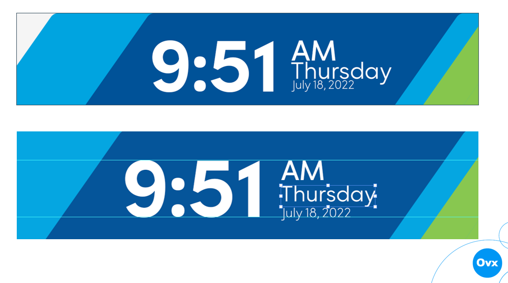
Details are everything – does your text line up? Is your line spacing consistent? Do elements in your design connect? Charles Eames, a famous architect & furniture designer, said, "The details are not the details. They make the design." Details like lining up elements in your design are essential. In this example, the top image's time, AM/PM, day, and date elements appear disjointed. The baselines do not match up, and there's no space between the elements. The bottom image quickly fixes the details and presents a more appealing and professional-looking digital screen.

Now it is time for you to research and get started sketching your next digital screen layout! Read our Designing for Accessibility for additional information.
